An Art Buyer's Practical Guide to Color Theory
Color is to art is like flavor is to cuisine. The range of possible manifestations of both qualities is so vast it seems infinite. We can only describe colors and flavors in terms of our experience. We can say, "Bananas are yellow and sweet." But not all bananas are yellow, and the yellow ones aren't yellow at first, nor are they yellow long. And the intensity of a banana's sweetness is affected by aromas, potentially adding or deleting perceptual layers. A chef could spend an entire career analyzing the complexities of flavors. So could an art lover spend a lifetime attempting to describe the color combinations in a single painting and the range of effects it produces on his psyche. This is the essence of color theory: we are endeavoring to describe color and its corresponding effects. It's difficult, perhaps even impossible, but that's the fun of it.
"Color is crucial in painting, but it is very hard to talk about. There is almost nothing you can say that holds up as a generalization...it depends on too many factors..." - Roy Lichtenstein
Color Concepts
Many profound thinkers have attempted, perhaps futilely, to adopt a unifying color concept, notably among them Leonardo Da Vinci and Isaac Newton. What's been said and written about color fills volumes in the library. Yet the more we study color the less we all seem to be able to agree about its qualities. We know colors make us feel something. And we know that talking about our feelings can help us connect.
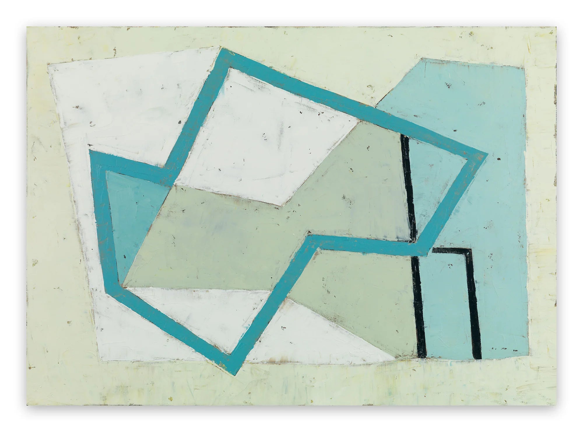
In her project "Time Keeping With Color," upcoming IdeelArt artist Debra Ramsay uses color to evoke seasons and the passing of time. By applying acrylic paint to fabric and board, she presents color bars in arrangements that suggest powerful, universal emotions. When looking at work like Ramsay's, don't worry about getting the lingo right. Simply let your color vocabulary grow out of your genuine interests and passions. Let your personal reaction guide you in describing how color makes you feel.
"The color of the object illuminated partakes of the color of that which illuminates it." - Leonardo da Vinci

Debra Ramsay - Honeysuckle 4, 2016. Acrylic on clear plexiglass. 21 x 50.8 cm.
Light and Pigment
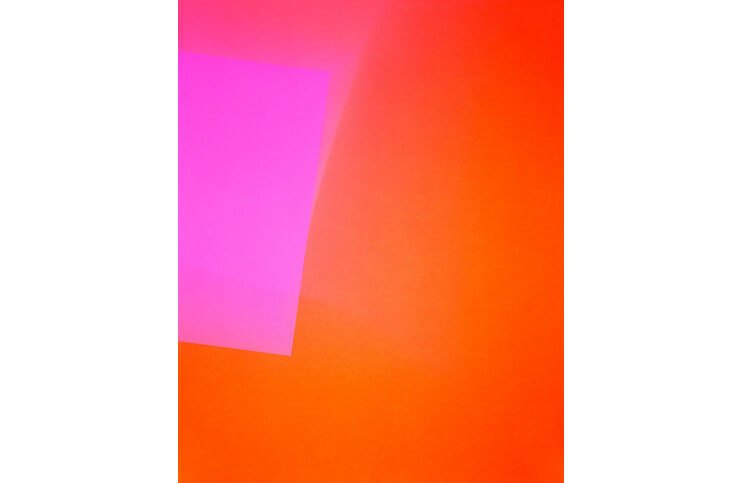
Color behaves differently as light than as pigment. Mixing red light with green light makes white light. Not so with red and green paint. This is why a color combination in a painting by abstract artist Richard Caldicott affects viewers far differently than the same color combination in a piece by light artist James Turrell. Ambient light also changes the experience of color. A painting shown in bright, white light reveals different hues than the same painting shown in soft light or yellow light.
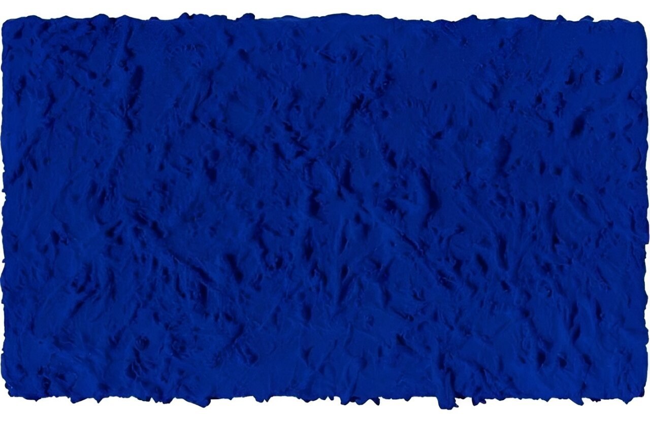
"Color is sensibility in material form." - Yves Klein

Richard Caldicott - Untitled 153, 2000. C print. 61 x 50.8 cm.
Warmth and Cold
Most people learn about warm and cold colors from weather maps. Hot climates are depicted in shades of red, cold climates in shades of blue. Typically, if a work of art is dominated by colors associated with daylight, such as yellow, orange and red, it can be said to have a warm color palette. Works dominated by blues, greens or grays can be said to have palettes that're cool.
"The whole world, as we experience it visually, comes to us through the mystic realm of color." - Hans Hofmann

Daniel Göttin- 2003 Untitled 3, 2003. Acrylic on cotton fabric on MDF. 40 x 36 cm.
Lightness, Saturation and Hue
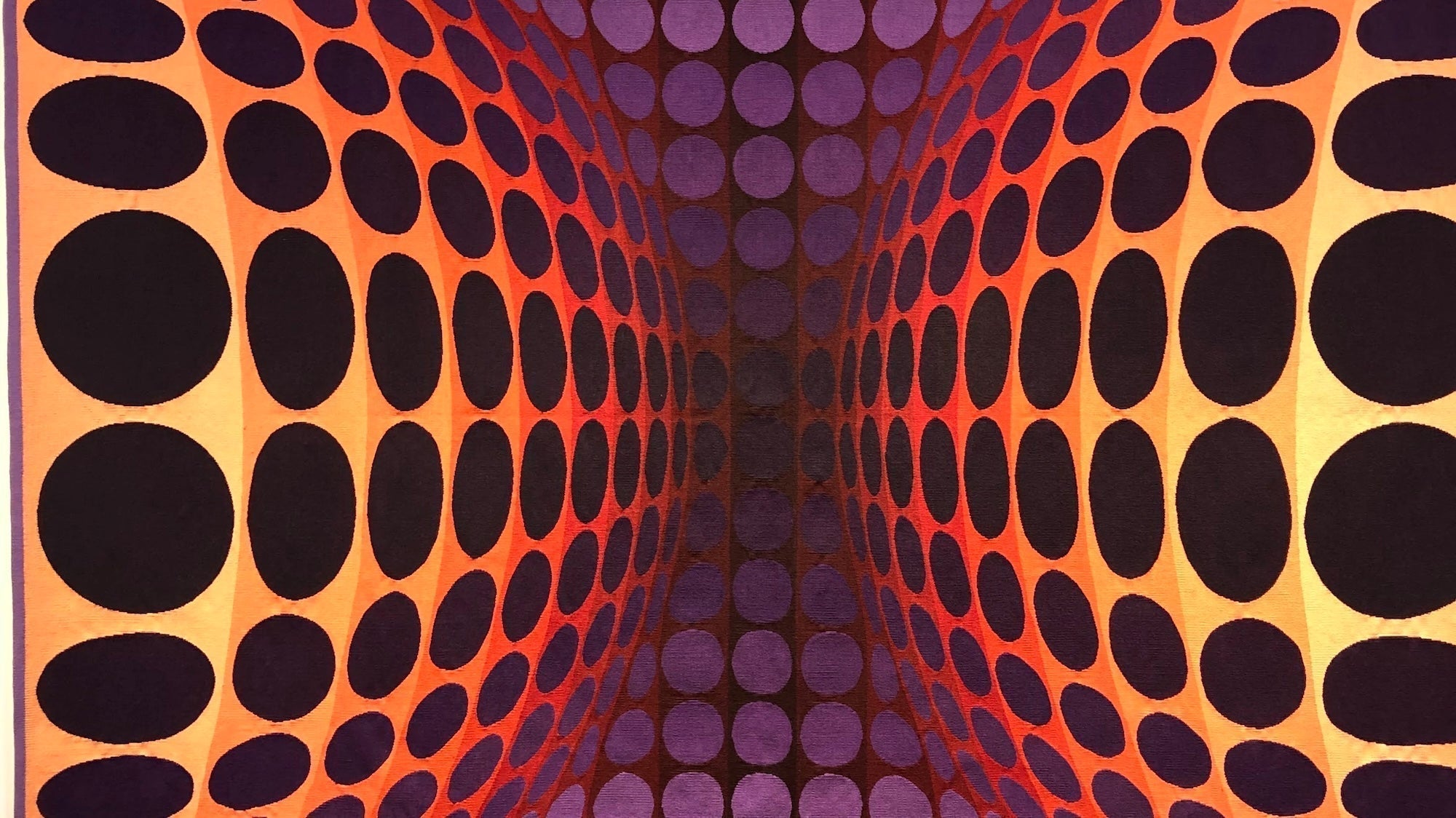
Almost every experience humans have with color is affected by the factors of lightness, saturation and hue. Lightness references how bright or how dark the color appears to be. Saturation references how vibrant the color seems. Hue describes the color itself. The human eye can perceive far more than just the colors of the rainbow; it can perceive nearly three million different hues, a reality explored with intensity and depth by abstract artists like Tilman who explore bold, monochromatic themes in their work.
"Why do two colors, put one next to the other, sing? Can one really explain this?" - Pablo Picasso

Tilman - Anywhere Now 19.15, 2015. Lacquer on MDF and aluminium. 110 x 120 x 4 cm.
Color Harmony
Some art buyers seek work that makes them feel on edge or restless. Others seek work that gives them a sense of calm. That makes the most personal, and therefore most important concept in contemporary color theory the idea that together certain colors can seem harmonious. The abstract painter Daniel Göttin experiments with this concept in his paintings, creating harmonious color combinations, which each seem to vibrate with their own emotion and sensibility.
"Seek the strongest color effect possible. The content is of no importance." - Henri Matisse
The most important point to remember about color theory is that as art buyers, we're under no obligation to talk about it at all. We're free to develop theories all our own. What matters is what the colors mean to us.
Featured image: Richard Caldicott - Chance/Fall (11), 2010, 2010. C print. 127 x 101.6 cm.
